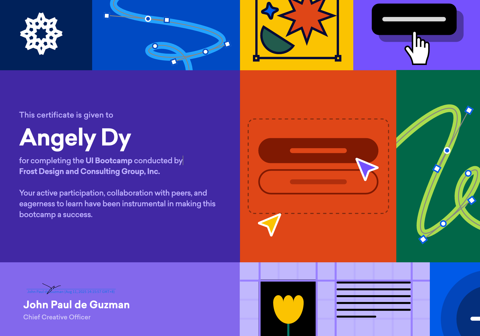
🌟 Just wrapped up an inspiring 7-day journey at the Frost Design PH Bootcamp! 🌟
It started as simple curiosity lang then turned into a week of breakthroughs, “aha!” moments, and design principles I’ll carry with me moving forward.
Day 0 was all about wisdom and warm introductions from Sir JP (and if you happen to be reading this, sir— hello! 😄👋).
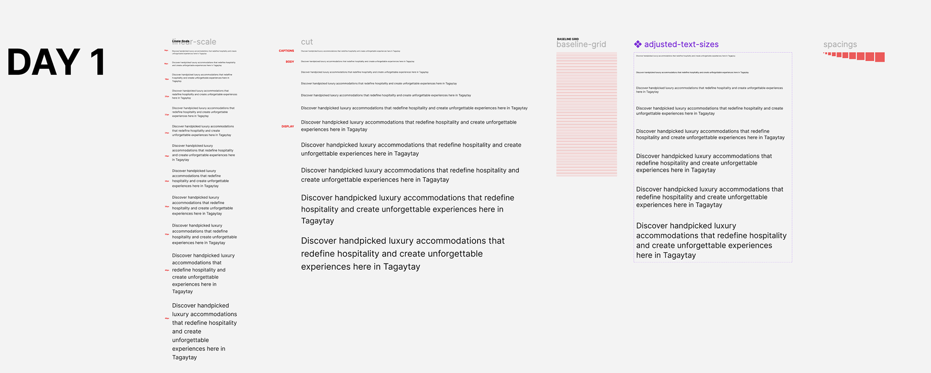
Day 1 kicked off the real training: typefaces, typesetting (my weakness 👀), 8pt grids, and the golden rule of using percentages (not absolutes!) for line heights.
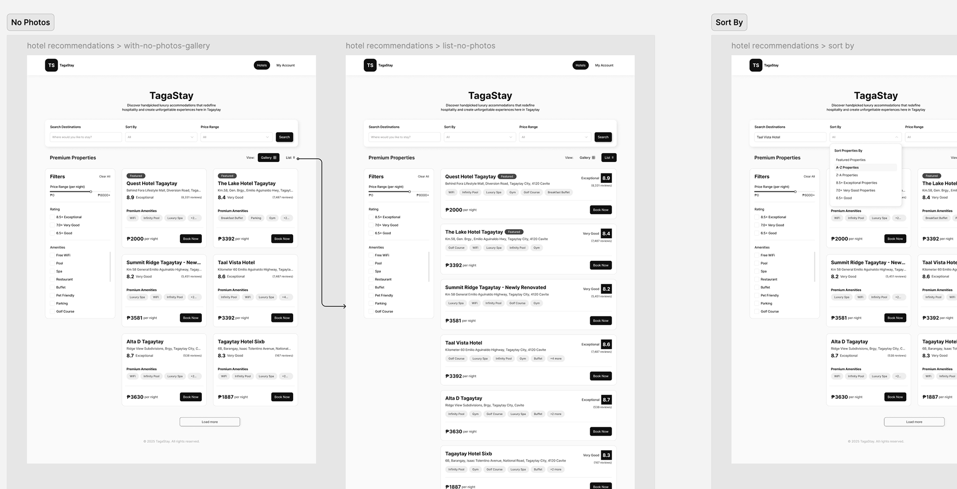
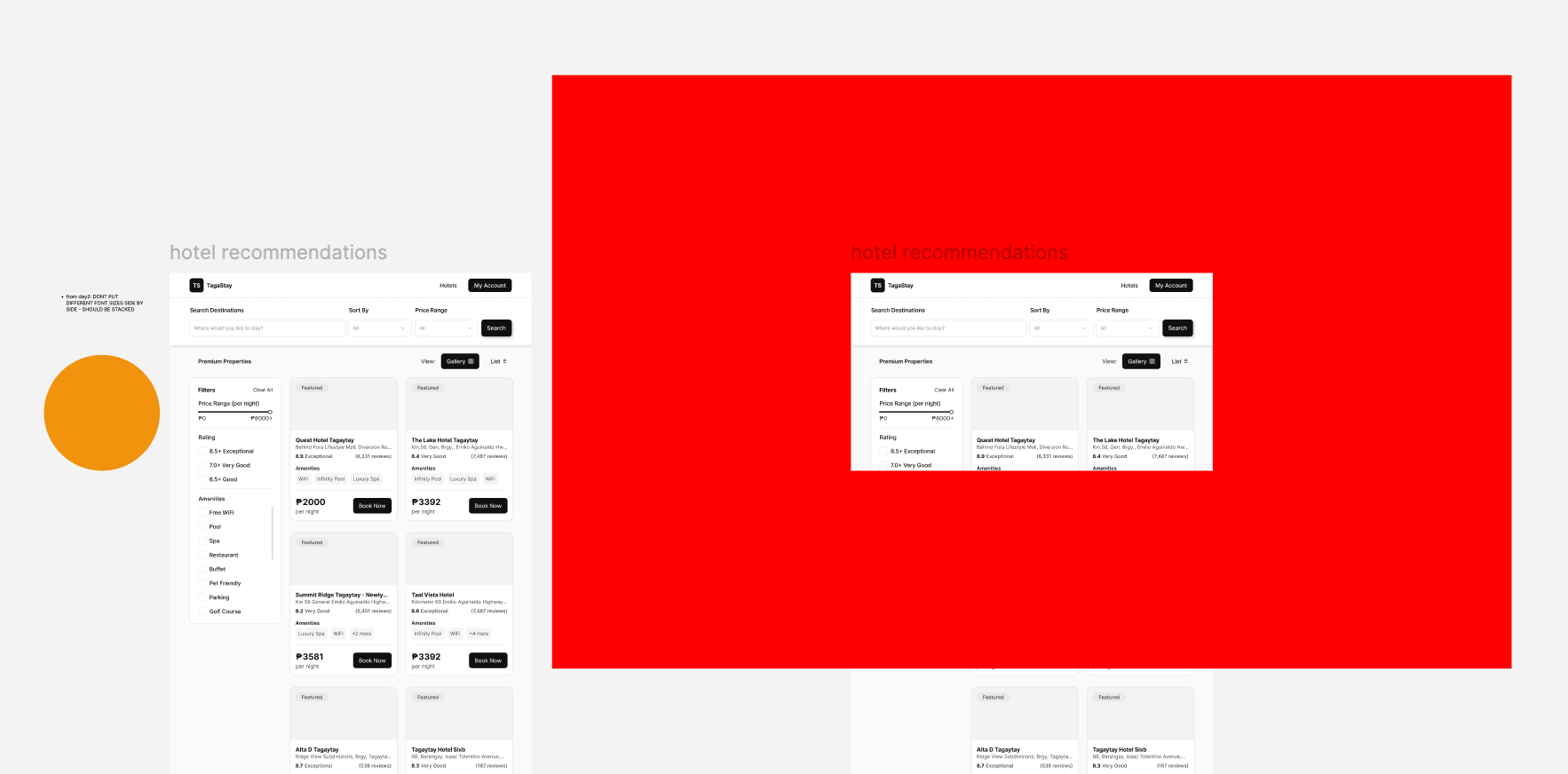
Day 2: max 60 characters per line, no side-by-side font sizes (stack them!), and the discipline of clean scaling, screen standards, and renaming layers.
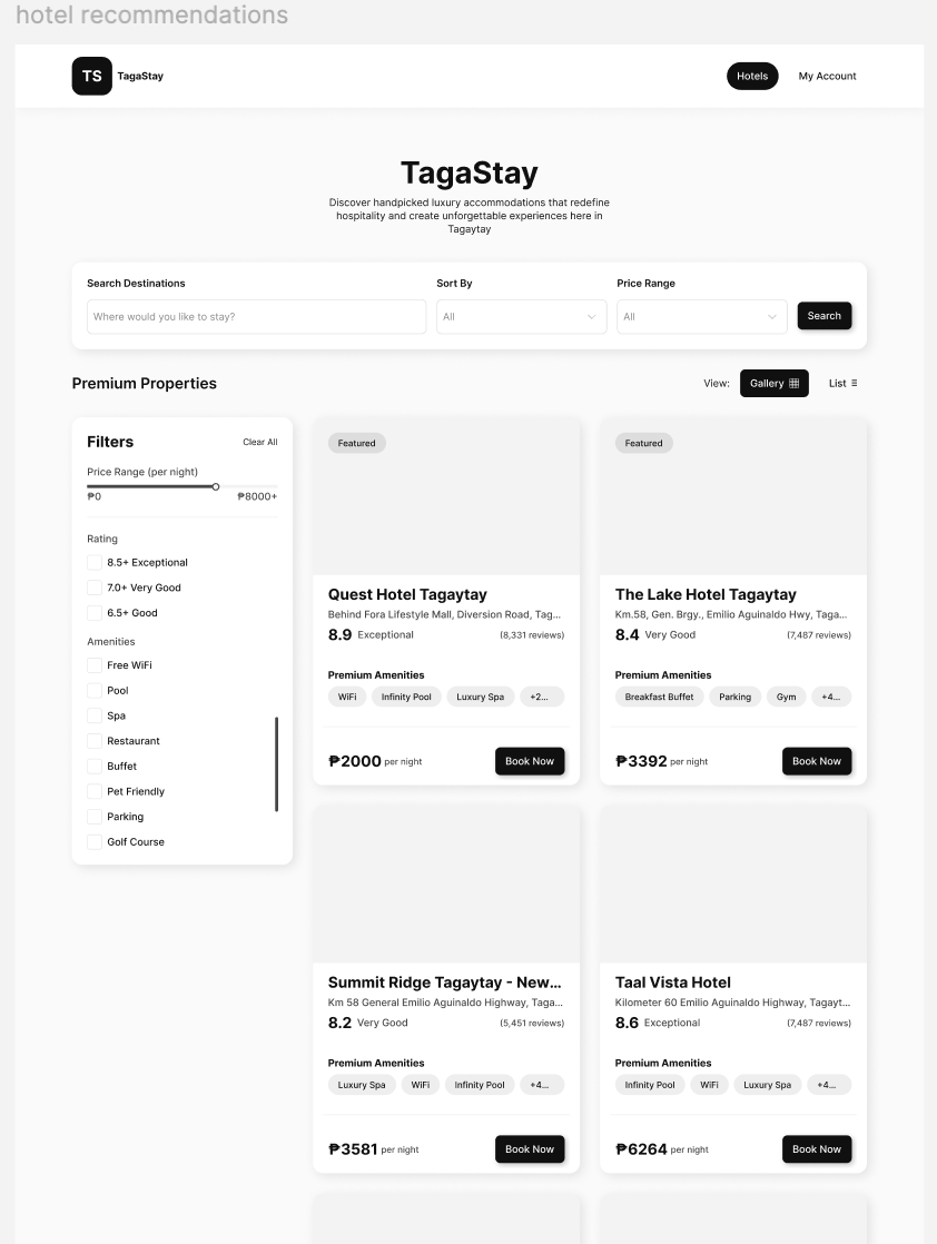
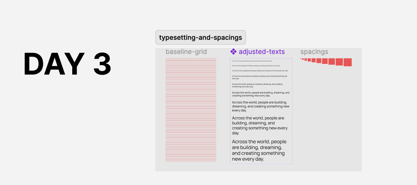
Day 3 was a reminder to always design with real-world needs in mind, like leaving space for ads, avoiding messy container-in-container traps, and trimming unnecessary information.
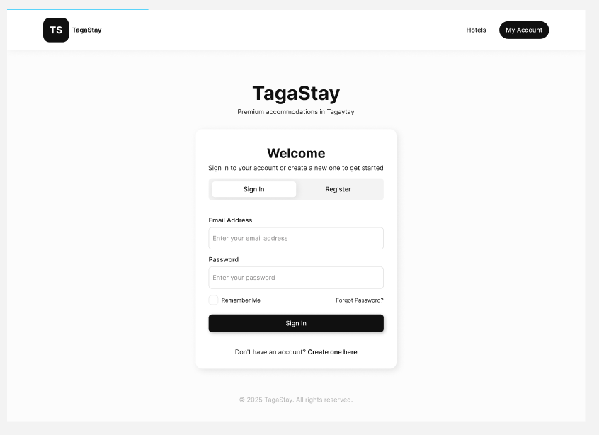
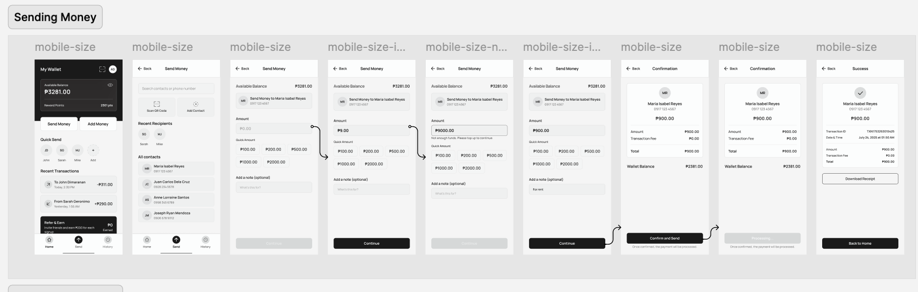
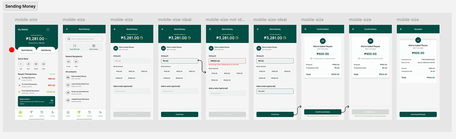
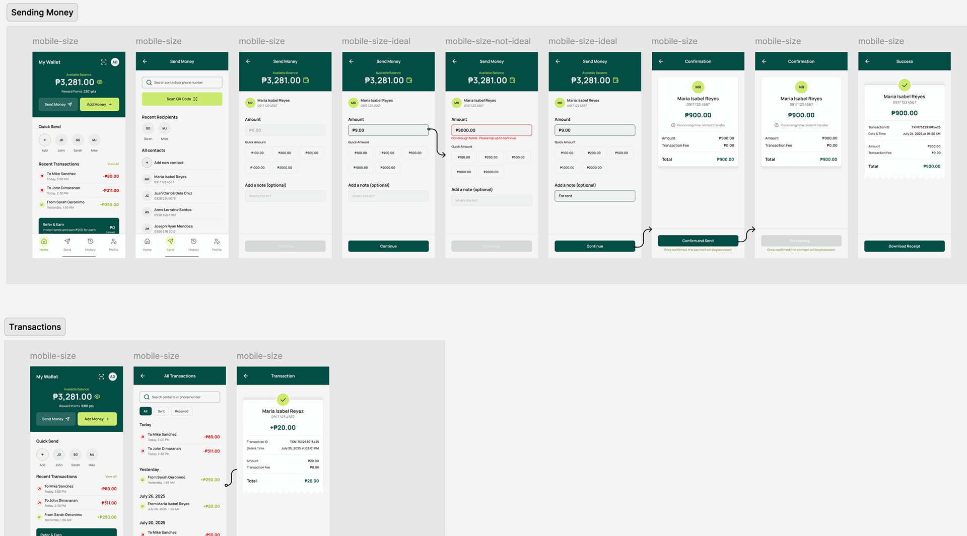
This time, we shifted from web screen sizes to mobile, focusing on e-wallet app screens for sending money, checking transactions, and viewing receipts.
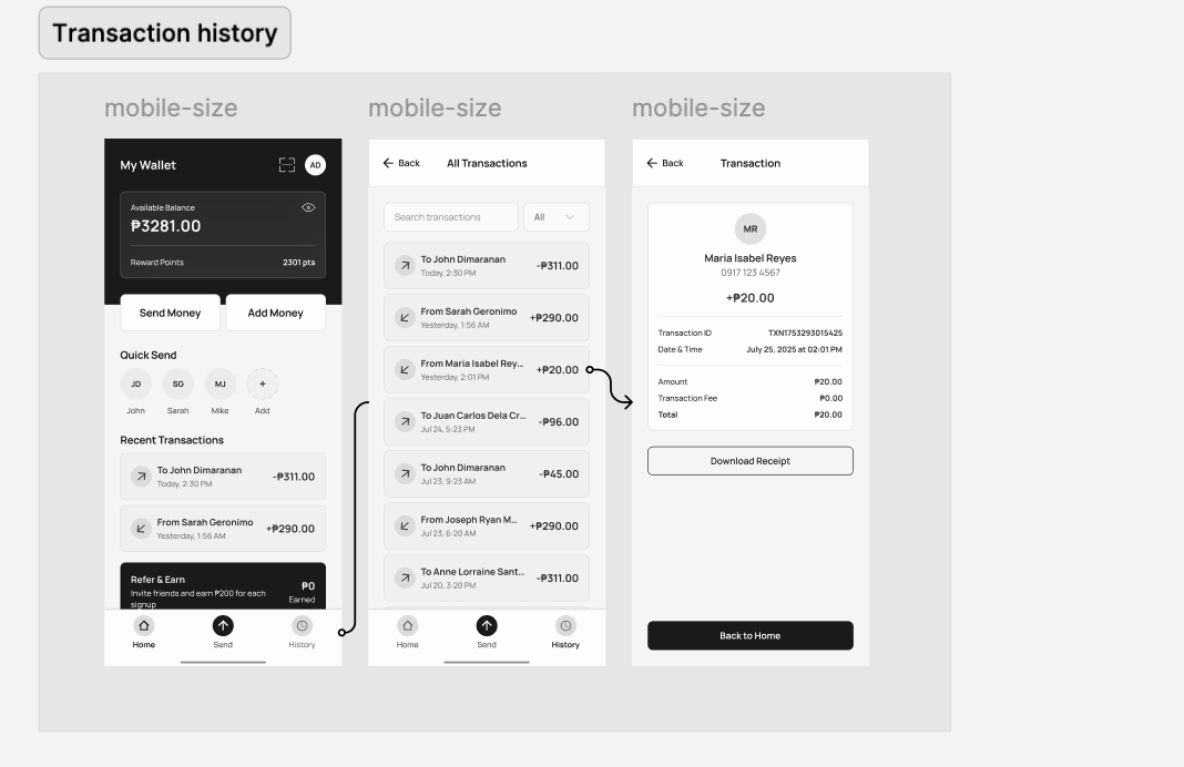
Days 4–7 were all about refining screens and adding color ✨. From equidistant spacing and contrast checks to shadows, grouping, trimming the noise, and unnecessary curves.
Huge thanks to Sir JP de Guzman for sharing so much knowledge with us — and for free! 🥹 The bootcamp was definitely intense (syempre in the best way), and it really pushed us to grow, reflect, and even unlearn a few design misconceptions we didn’t realize we had. Every single day, there was something new — lessons I’d never encountered in school or past projects.
I’m also super grateful for all the constructive feedback we got from Day 1. It wasn’t just about designing better screens, it was about learning how to think like a designer.
Big thanks as well to the entire Frost Design team, kudos to other designers who jumped in with their insights, and the recruitment team for giving me the chance to be part of this. 🙏✨
Definitely one of the most valuable weeks in my design journey so far.